


Logo Design
It’s tricky to develop a good logo! You want something that is identifiable, memorable, and communicates a message to those who will be looking at it. Company logos have the luxury of evolving over time, it’s the work that a company does that will make it last, and the logo is rarely a deciding factor in whether or not a company succeeds. But up on a title screen? It’s going to be the first thing that many people see, and it’s gotta put them in the mood.
Our current game’s title itself has gone through a few iterations since we began conceptualizing it. We initially were working on a different game and decided that we needed to begin work on a second, less involved game that we could use to hone our skills, refine our pipeline, and in general get our feet wet with game development. And so was born: Project B. Catchy title, right? It’s what we were using for a few months. Our project slowly began to take shape and before we knew it we’d had ourselves fleshing out a retro beat-em-up inspired fighting game. So what was a suitable name for it? How about the overly obvious: “Beat ‘Em Up”, “Brawlfest”, “Retro Rumble”? Nah… we wanted to make a fighting game, but we didn’t want to blatantly beat our audience over the head about it. How about something a little less obvious: “Canuckle Sandwich”, “Out For Blood”, “World of Pain”? It wasn’t quite catchy enough.
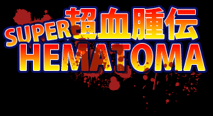
So, eventually we decided that we really liked the word Hematoma. It’s got kind of a “cute” easy to speak quality to it that rolls off the tongue… though realistically it’s kind of a disgusting swelling of blood under the skin. We wanted to give a bit of a throw-back to the old days of console games… I suppose it’s still a common trait for Nintendo published games to have “Wii, or 3D, or DS” released in the title… heck they did it with “Advance” and even the absurd “64” right? And so Super Hematoma was born. The more I said it, the more I liked it. And as it’s inspired by the prime era of Japanese games… we decided to go one step further with it. Let’s make the title include both English -and- Japanese!
And so we came up with: スーパーヘマトマ! (pronounced Supa Hematoma – written in katakana, the alphabet for foreign words). But wait… maybe if we’re going to appeal to the Japanese gamer, we should make it a little more authentic? Ok, so let’s try スーパー血腫! (pronounced Supa Kesshu! – written in a combination of katakana and kanji as kesshu is the equivalent word in Japanese for hematoma). Hmm… except that’s not quite right either… sure there were lots of Super Famicom games that used スーパー in the title… Super Mario World and Super Metroid for example… buut there were some other games that used the word 超 (Chō) instead. Super Ghosts and Goblins and Super Bonk for example… it expresses the meaning of the word super without being a cop-out and using the English word. And so we went with 超血腫 (Chō Kesshu)… until Matt pointed out that that sounds more like we’re talking about -a- super hematoma… and not quite expressing the same thing between the two languages. And so we decided to go with 超血腫伝 – (Chō Kesshu Den, which is more like a story / stuff going on about / in the context of/regarding to super hematoma).
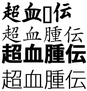
So we had the name… now to come up with the actual logo. Part of what’s difficult with logos is coming up with a font that’s the right style for what you’re trying to say. I mean… we could of course fall back on the traditional Comic Sans for the English text… but what about the Japanese? Turns out there’s not very many free Japanese fonts out there… with so many kanji to deal with a Japanese font takes a lot of time to develop. Even more annoyingly, is that a lot of the time people will give up on doing it the thorough way and just map characters to the English keys… so you end up with a font that looks nice, but you can’t type the words the standard way… and as a non native Japanese typist, there’s no way I was going to be able to figure out how to type the characters I needed. And then sometimes you have a font that looks good, but as you can see at the top of the right image, doesn’t necessarily include all characters you need. Luckily I was able to find an appropriate (at least I think so) font to work with, and pair it with a decent English font.
So we started doing iterations on the text… we wanted it retro-y… so we used a fairly limited palette. I experimented with some different fonts, proportions, spacing, overall silhouettes… I discovered how to work with 3D geometry inside Photoshop (saved me from having to try and work in a full fledged 3d Package which is nice for this type of conceptual work!). It was actually a lot of fun once I started going, trying to figure out how to make an appealing image using words. I felt like a lot of the designs were reminding me of old comic books more-so than old games, so I started to try to make it a little more modern. Less flat colors and more gradients. More outlines. Eventually I started elaborating with some blood spray… does it cover the words? Or just the background? And how does this all look if we have some stuff surrounding it?
I’m not quite sure if we’ve got it nailed down with that Featured Image at the top of the post, but I’d say we’re pretty darned close.